Every week on “Sunday Page” an author has to choose a single page from a comic book. It could be for sentimental reasons o for a particular technical achievement. The conversation could lose itself in the open water of the comic book world but it will always start with the question: «If you had to choose a page from a comic book you love, what would you choose and why?».
This Sunday I’m out with Peter Milligan is a screenwriter who started his career in the early 1980s by collaborating with 2000 AD magazine. He later worked for DC Comics (Detective Comics, Animal Man, Shade the Changing Man, Human Target, Hellblazer) and Marvel (X-Force, X-Statix, X-Men).

I know it’s a bit cheeky but I’m going to choose a page from something I wrote. Not to big up the writing or story, but to talk a little about the two artists involved, both of whom are now sadly dead: Steve Dillon and Brett Ewins.
Steve was the more famous of the two, owning to his work on Preacher etc. But Brett did a lot of fantastic work in his career. These artists were very different. Brett perhaps didn’t have Steve’s natural technical gift, the natural drawing ability to be able to dash off a page of artwork while sinking a pint of beer in a pub, but Brett had something different. A fantastic ability to pin down a certain kind of character with an image. A great sense of design. And a fierce intelligence that often shone through, whether he was working on the book in question – Skreemer – or a Judge Dredd story for 2000AD.
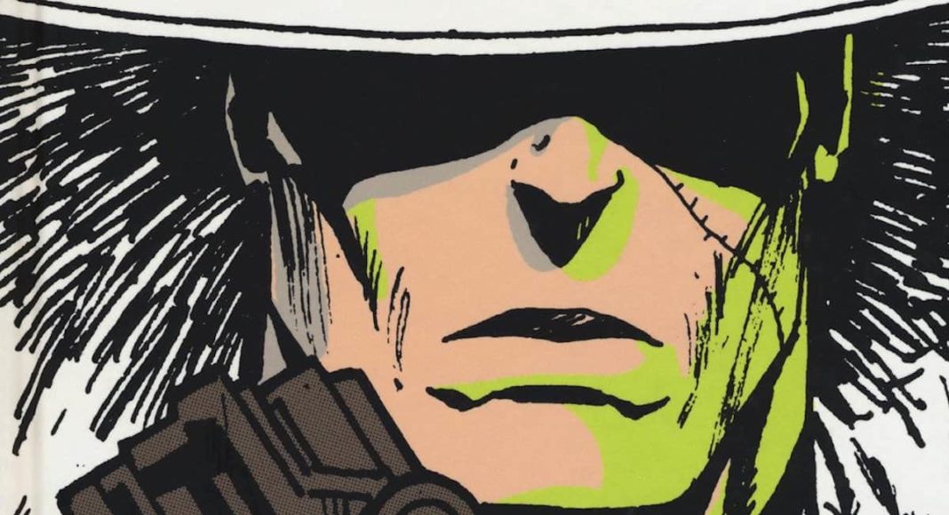
Skreemer was my first series for DC Comics and the idea – of a gangster who was blessed or cursed with intimations of the future – came to me one night while talking with Brett. On this page – simply but beautifully laid out – we see the hand of both Brett and Steve. The design of Skreemer, larger than life yet full of pathos, and the fluid line of Steve. Skreemer spends much of his time standing on this edge, as though toying with the future and the destiny that he has glimpsed. If he can jump, if he can fall, it means his destiny changes.
There’s nothing flashy about the page. Nothing really stand out, It’s just a beautifully simple page of art that successfully tells the story that’s being told.
And sometimes, as a writer, that’s exactly what you want.


